Assignment 3: Spatial Data
Step 1: Choosing A Source
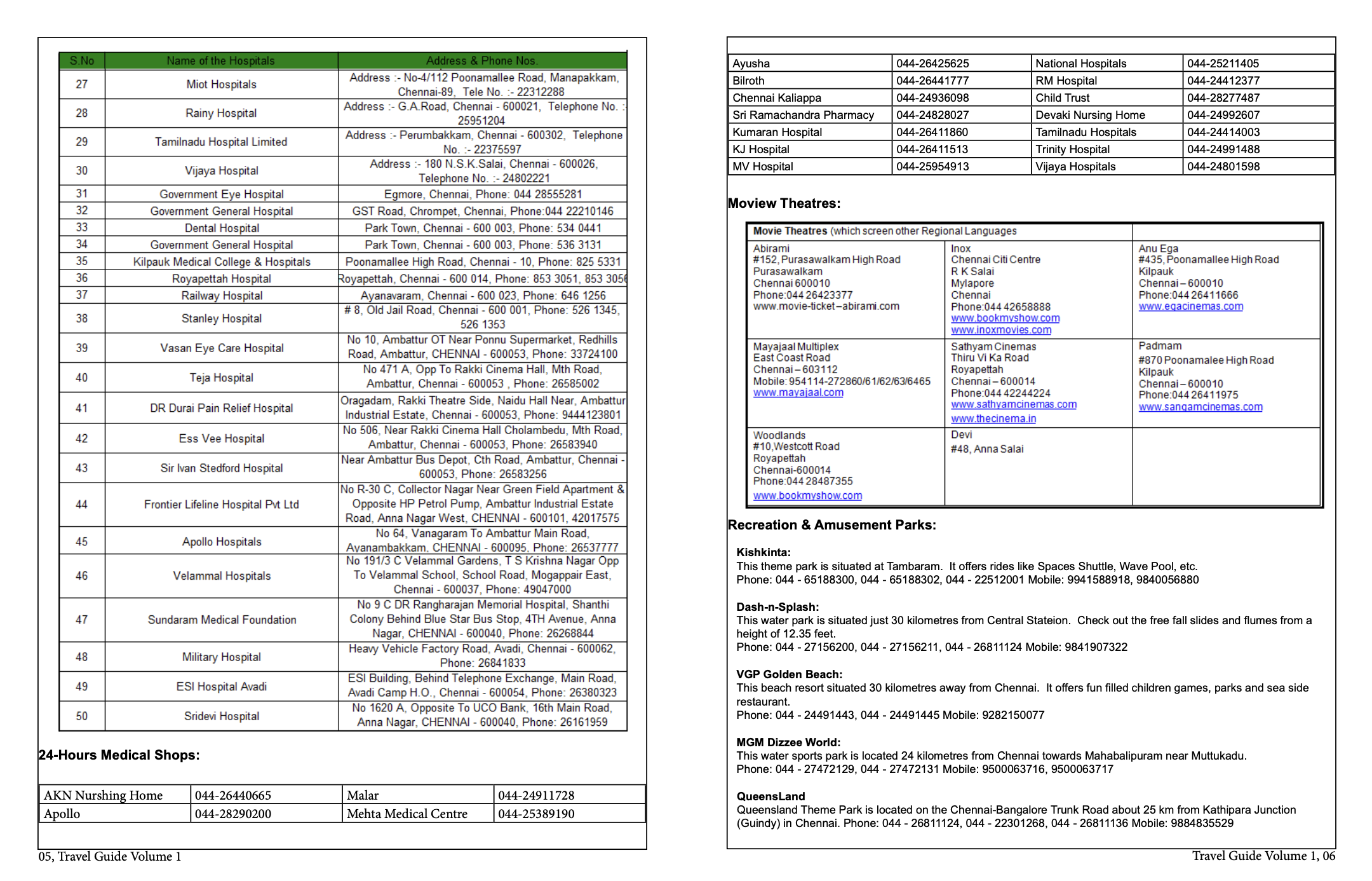
For this assignment I chose source #3, Travel Guide to Chennai. On looking through the provided sources, I found the fact that Chennai’s travel guide mostly focused on medical tourism quite intriguing. Having previously associated Chennai with vibrant colours, temples, a bursting coastline, and a city with a rich history; the travel guide was not what I had expected. However, upon reading the summarised information in each section of the guide, I found out that Chennai has been dubbed to be India’s health capital. Going through the rest of the document, it becomes apparent that entertainment, amusement parks, and movie theatres follow suit with Chennai’s medical tourism. The coupling of health and entertainment begs the assumption that mental health is just as important as physical health. Maintaining a state of ease, relaxation, and happiness through Chennai’s national, amusement, and water parks is crucial to its health tourism whether the families of patients are over to visit or patients themselves having a breath of fresh air.
Step 2: Modelling The Data
The data modelling process for the Travel Guide to Chennai started off by determining the data available within the text. The guide is relatively short and contains a few organised tables of 50 hospitals, 24HR Medical Shops, Movie Theatres, Recreational & Amusement Parks and finally a long list of links to hotels, taxi companies, ticketing offices, and travel services.
I chose to work with the 50 row hospital table as I found it to be large enough for this project. The table is organised alphabetically and provides information on the hospital names, addresses, and phone numbers. I chose to use the data within this table because I wanted to explore the ways in which chatGPT is able to organise it further.
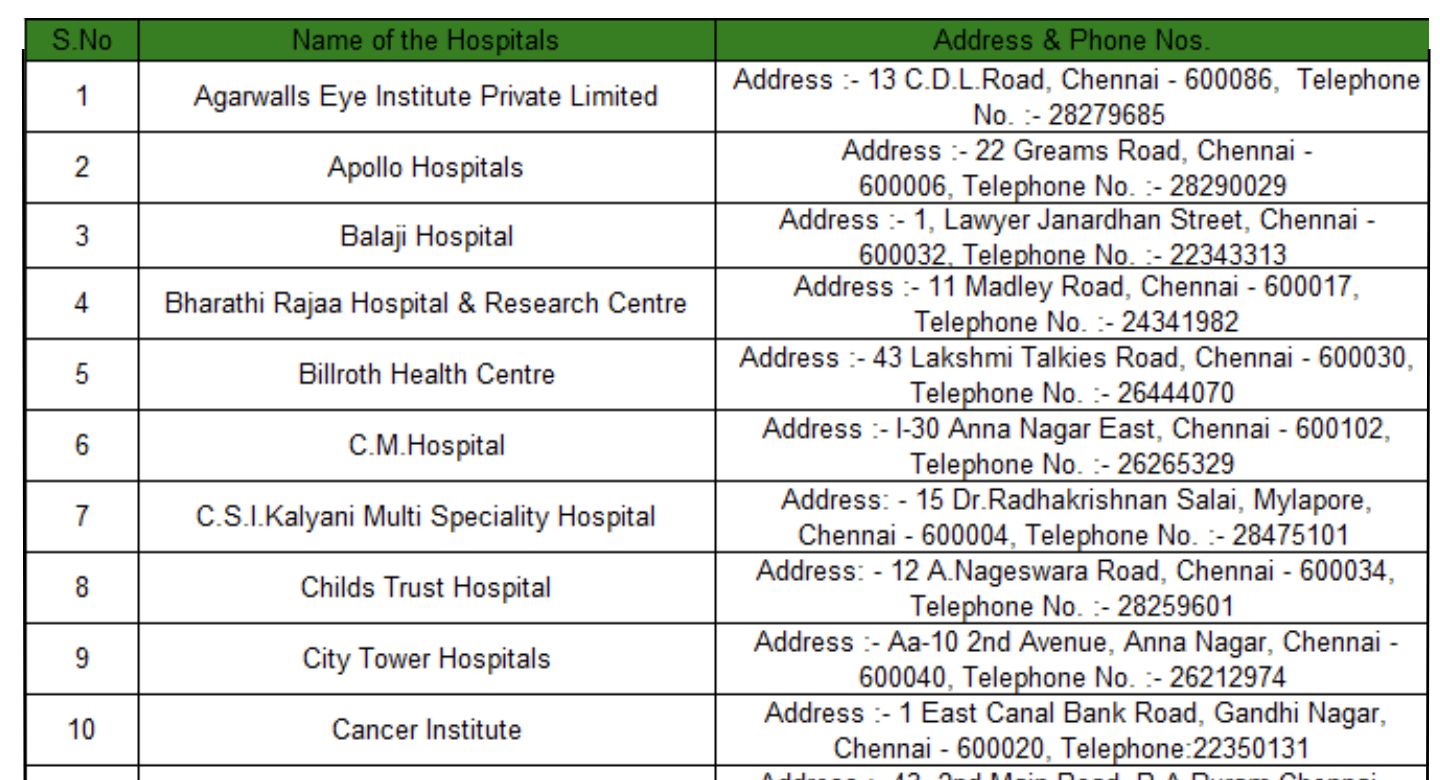
From the data in the table, what I found to be missing was the hospital’s specialisation. Some included the specialisation as part of the hospital name, i.e. Agarwalls Eye Institute Private Limited, while others had no way of identifying what the hospital can treat, therefore one would assume them to be general. Grouping hospitals together by specialisation would be a great way to then map onto space by assigning them different colours, eyes in pink, cancer in blue and so on. I also found that as the hospitals are grouped in one table and organised alphabetically, clustering these hospitals by location can be a great way to further enrich the data. This method is great for written data analysis but may also translate well into the map to see the method of grouping certain hospitals together. Do cancer hospitals usually cluster together spatially or does each town in Chennai have a few different hospital specialisations in a single place.
Step 3: Enriching The Data
As I discussed in the previous part, I copied the table from the txt file of the guide and pasted the 50 rows of hospital data into chatGPT.
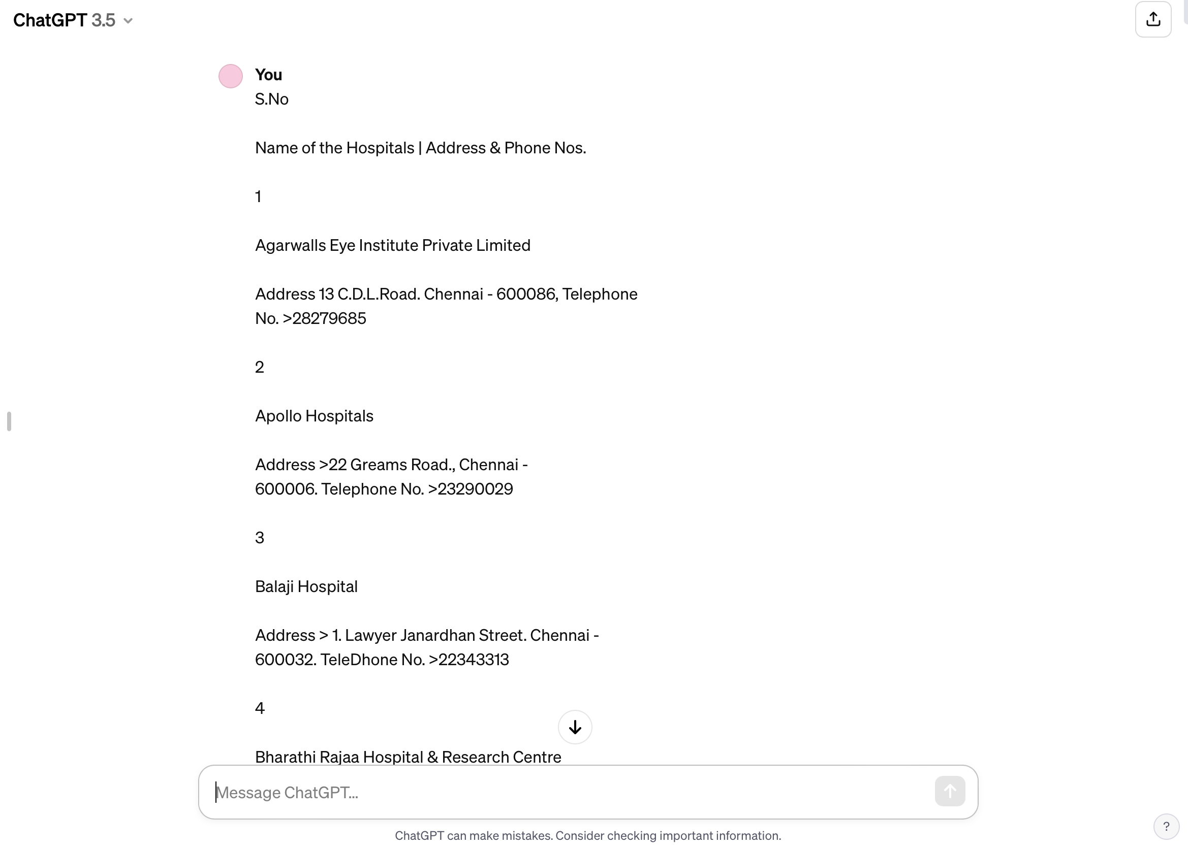
I then asked for the algorithm to place the information in an organised table once again as was the case on the guide. However, I asked the algorithm to add a hospital specialisation column and to separate the address from the phone number in two different columns. I found that chatGPT did a great job in adding the hospital specialisation and separating address from number, however I have also realised that some hospitals were specified general while others were Multi-speciality, I wondered how the algorithm knew to classify them as such from the hospital name.
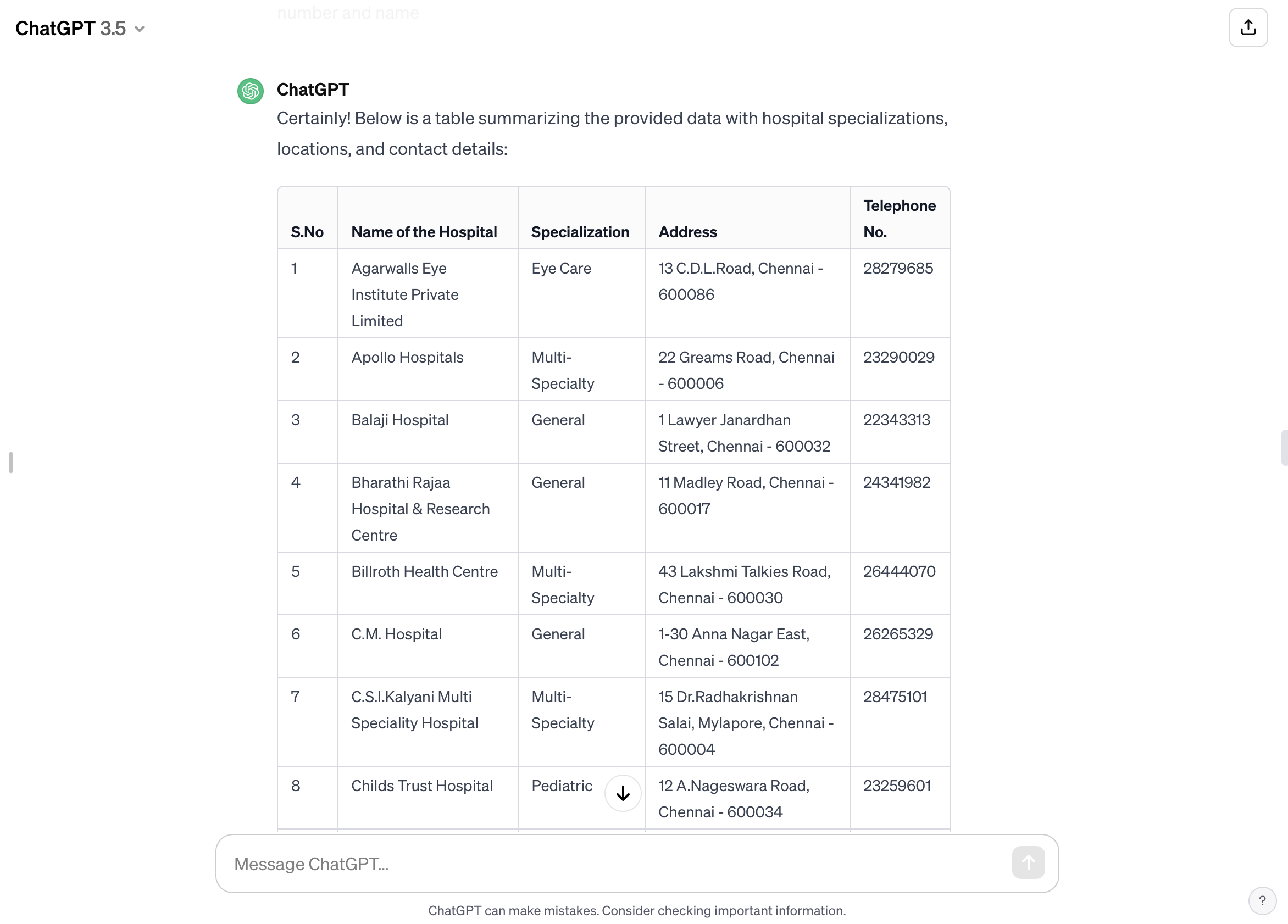
I asked chat if it worked with external data or solely relied on the table I provided and how the classification was made. I had to rephrase and re-ask my prompt multiple times to get chatGPT to answer. The algorithm solely relied on the table I provided therefore its classification was based on a certain pattern.
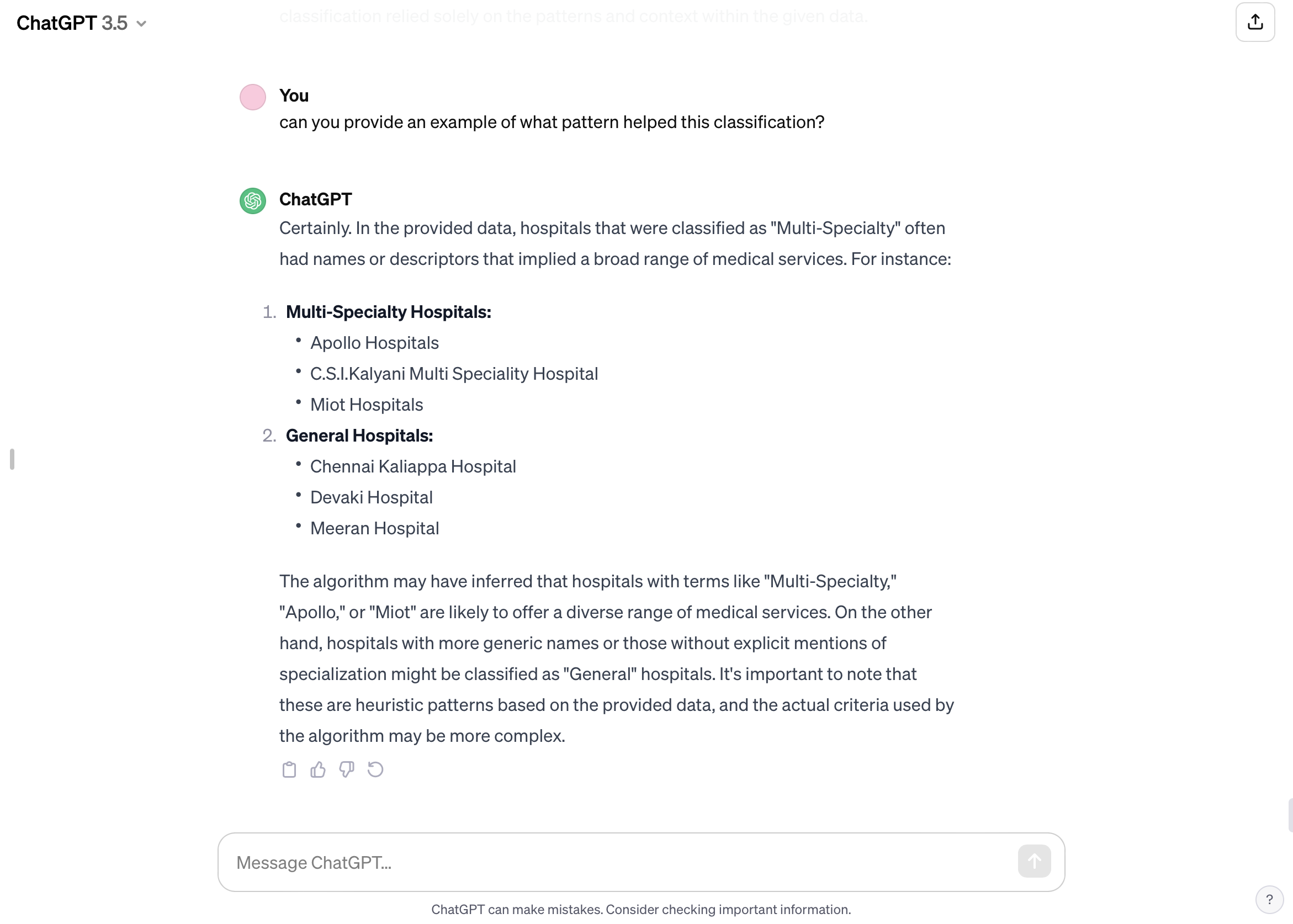
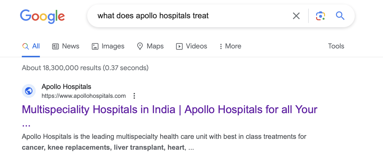
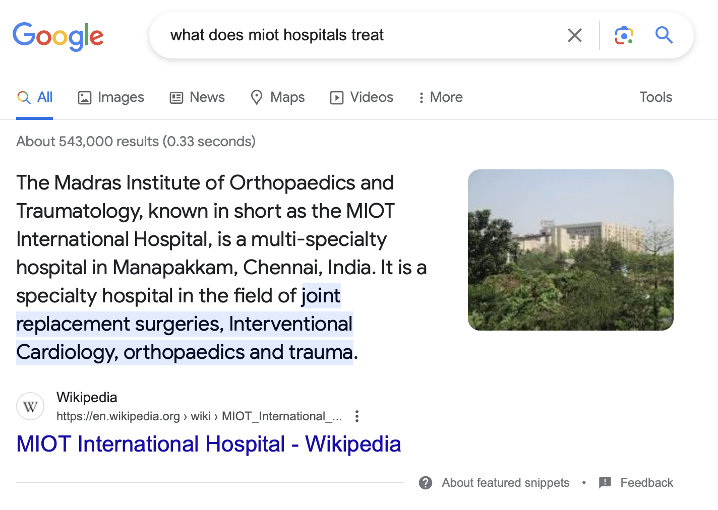
Given chatGPT’s answer, I set out to do my own research into the two hospitals “Apollo” and “MIOT” to look into what they treat.
Apollo Hospitals:
MIOT Hospitals:
I also realised another pattern that chatGPT did not mention, and I assume that is what it used to do this classification. Apollo and MIOT both used the plural “Hospitals” in their name unlike the ones classified general which used the singular “Hospital.” I now understand that the algorithm was a lot faster than me in identifying linguistic patterns that can be easily overlooked.
After this classification, I wanted the algorithm to organise the hospitals by grouping the same specialisations together. In this attempt, I noticed a possible shortcoming for the organisation. Multi-Speciality and General hospitals, although relatively grouped together, usually had an outlier somewhere else in the table.
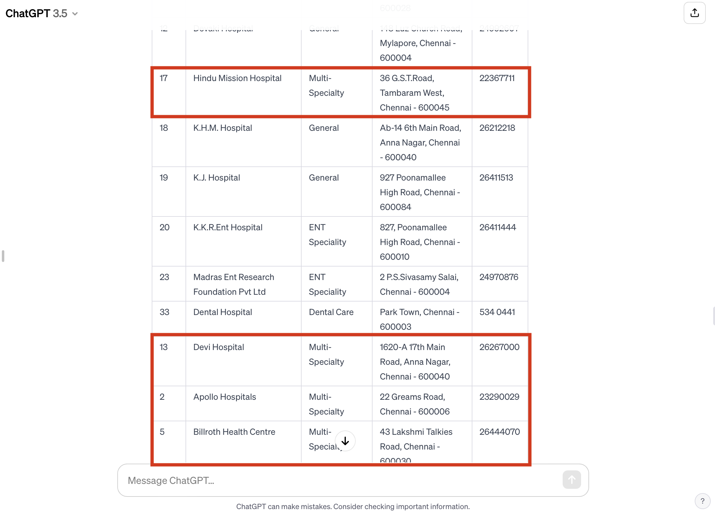
I did not worry about this as much since my purpose in the assignment is spatial mapping and not organising a written table, although I do understand that an organised table is crucial for the mapping process, I assume I can overlook this organisational detail as insignificant.
I asked chatGPT to then organise the hospitals by location and the result I got was fun and intriguing. The algorithm created multiple tables for each relative area: Chennai Central, Anna Nagar, Mogappair and Ambattur.
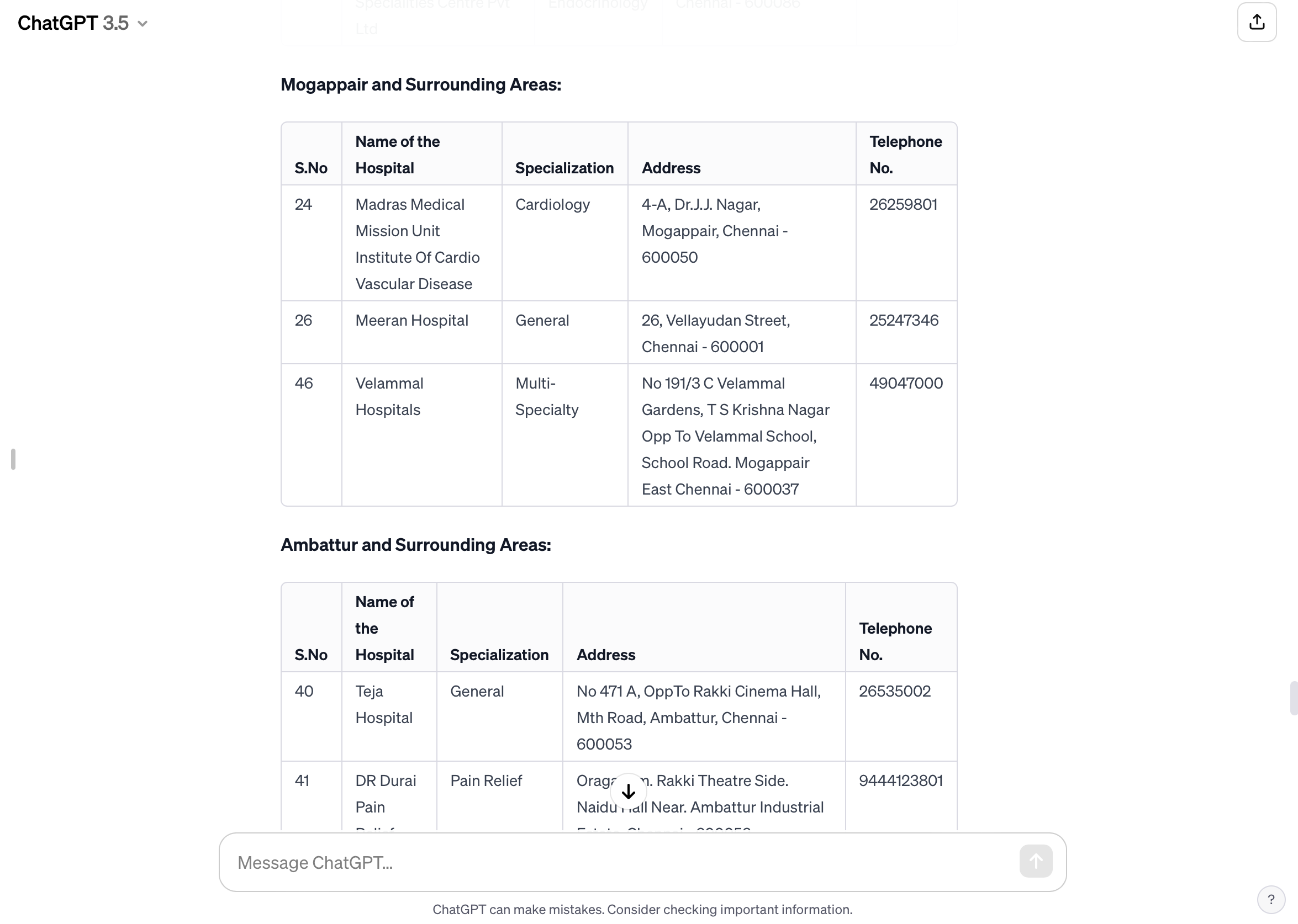
Finally, I took the complete list of hospitals including the organisation by specialisation and separated number and addresses to then move to Google Sheets before visualising the data.
Step 4: Visualising The Data
Upon moving my data from chatGPT to Google Sheets, I had to slightly clean up the table to remove the truncations done by the chatGPT algorithm. I also removed the first column of the numbered hospitals since the numbering is no longer relevant in the visualisation process.
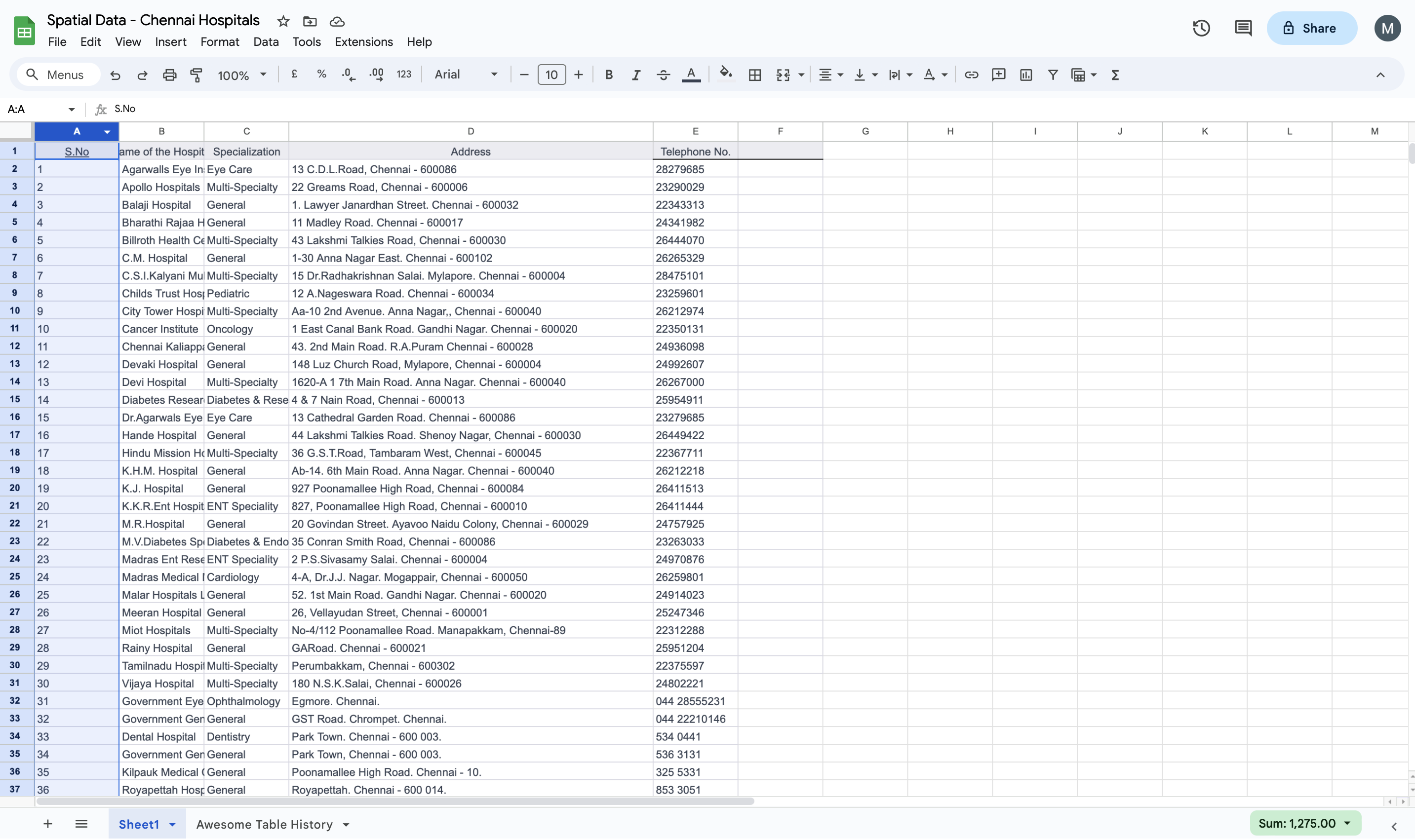
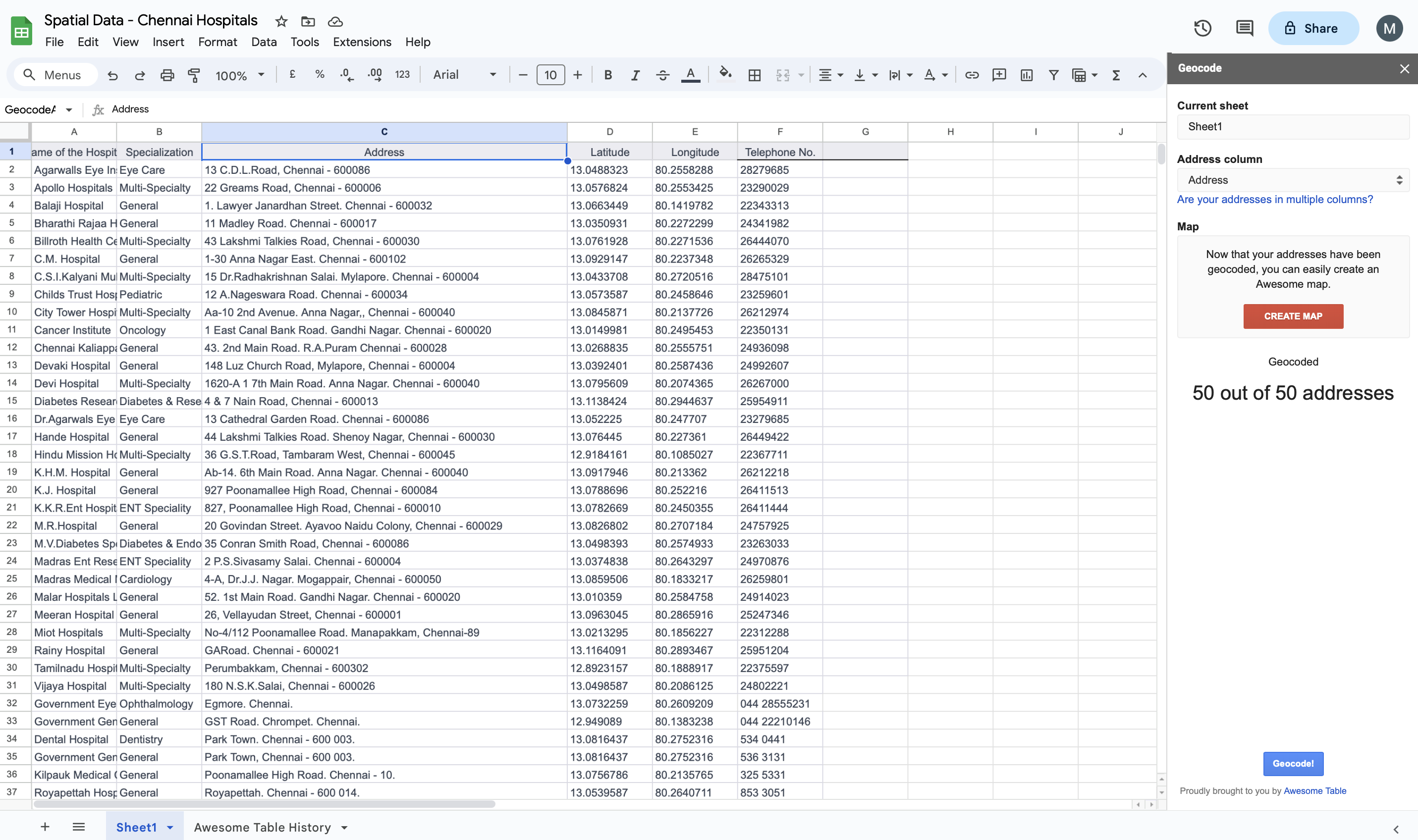
I launched the Geocode by Awesome Table extension to automate the geocoding process. Through the extension the automated process added the Latitude and Longitude to the data.
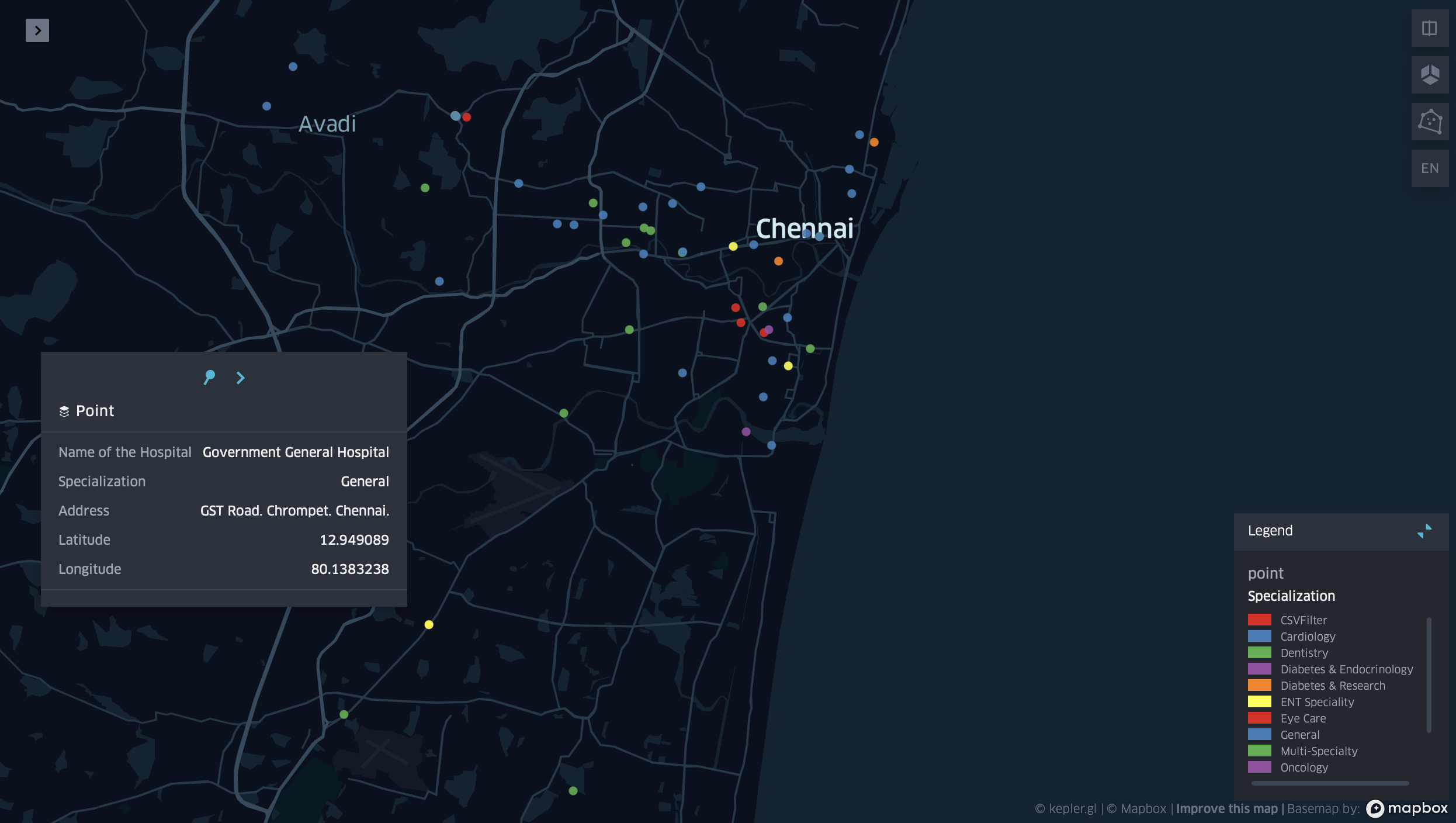
I then exported the full sheet as a CSV file to be moved to kepler.gl and ran the map. The result I initially got was a mere cluster of all the hospitals in one colour.
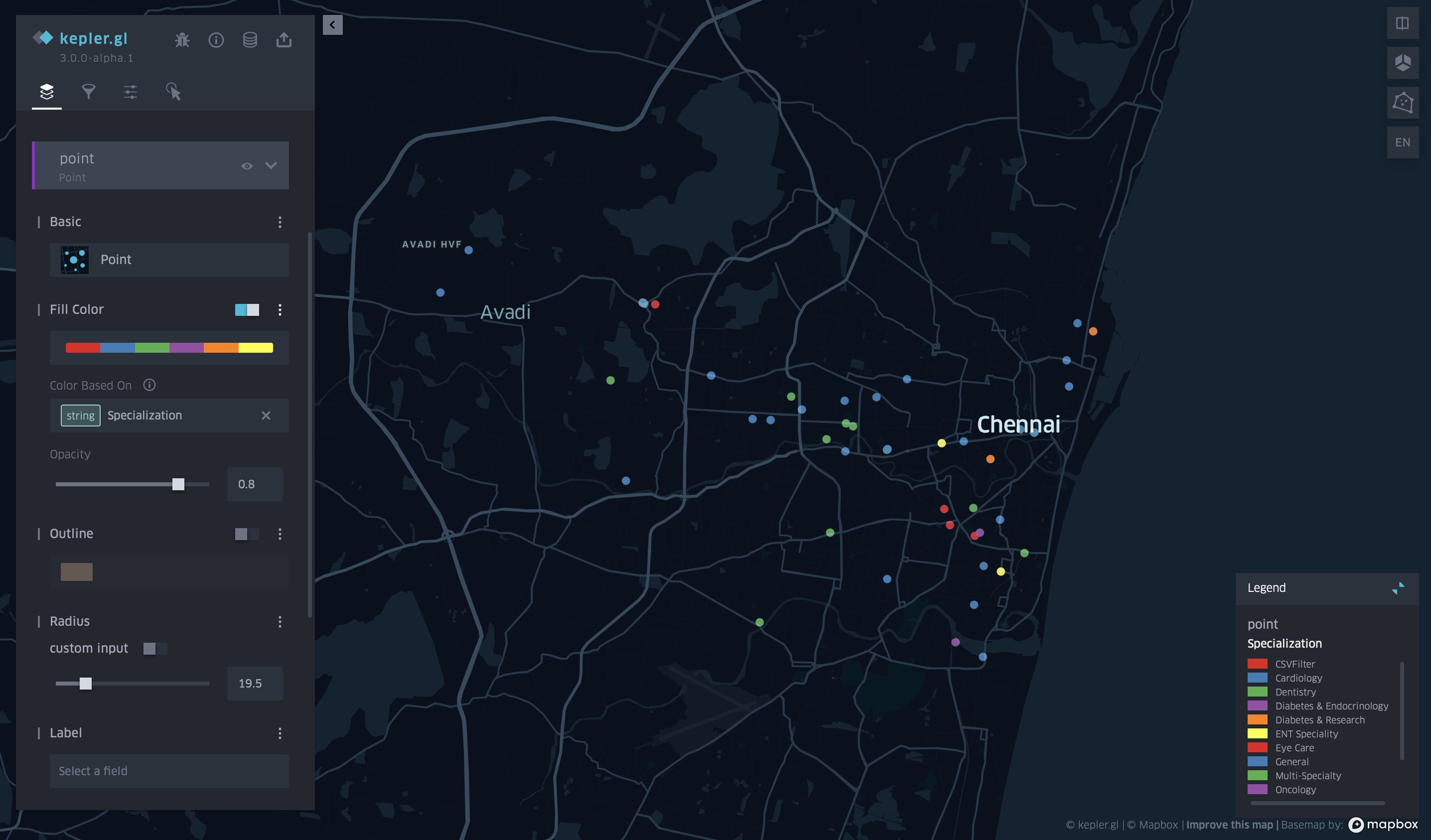
I then added a point filtration category so that the points will be classified by specialisation of each hospital and accordingly will each get its own colour. The final map is shown below with a legend of all the hospital specialisations and their colours.
Conclusion:
This process has been extremely interesting going from text to data and onto mapping is one of the skills I had been looking forward to learning since coming into NYUAD. Through this process, and specifically within this one project. I wish to take this guide further by also mapping the other tables for recreation, movie theatres and so on, to create a richer mapped guide to Chennai. I also do realise there is an overlap in the legend colours of the hospitals which I do hope to work on in the future to further this project. Overall, the process has been a lot simpler than I had expected and leveraging chatGPT in order to extract, organise, and automate the information provided from a text file is very refreshing and fast. It is a skill to be able to write prompts and feed algorithms to work with you and not against you and to understand their limits.
